Well this dampened paper business was never going to be simple. I have never tried it for a whole edition until and I need 110 perfect copies - soon.
I started off on Saturday morning and the results were disastrous. The ink simply did not adhere to the paper enough to give a good black - just a washed out grey. In the end, I gave up, went indoors, lit a log fire and watched the rugby. I was out of sorts for the rest of the day but then had something of a brainwave in the evening which ascribed my failure to the low temperature in the studio. I had noted that the ink was very stiff while I was rolling it. I resolved to try again in the morning.
Sunday morning was another crisp clear and cold morning. I boosted the temperature in the studio with another heater and propped the glass inking slab, and a tube of ink over a small oil filled radiator. At this point, we took Bella out for a gloriously sunny walk through the lanes and the nature reserve. When I returned, the studio was piping hot and the ink slab warm. I selected the music (live improvised ambient soundscapes by Robert Fripp) and made a large mug of steaming tea before setting to work.
The ink was much runnier and a first attempt with dry Zerkall paper gave a lovely impression. I took the sheets of dampened Saunders watercolour paper and started to print. Things went very well indeed and I printed about 70 copies in about two hours. Things were starting to go wrong at this point. The prints were starting to smudge, as if the paper was shifting under the tympan. In the end, I lost five copies in a row and decided to give up again. I remade the packing but this didn't solve things. I tried a print with a loose card and paper pad between the block and tympan but had the same problem. I am sure that the problem is in the packing and I have redesigned this with a view of starting again this evening. I checked the prints, which are drying with interleaved sheets of paper between boards with bricks on top (neatly wrapped in brown paper) to keep them flat. I have 58 reasonable copies so I need over 60 more before I can finish this job. I was hoping to get this done over the weekend as I have engraving work to do. Its certainly put the dampeners on things!
Still, yesterday evening was lovely with a log fire, candles round the room, a bottle of good wine and Bruckner's 9th Symphony in the background - well you have to get away from the ink sometimes!
Monday, November 21, 2005
Tuesday, November 15, 2005
Garden Engraving

I showed this engraving "on the block" a few days ago and here it is finished. It shows part of the garden that we have made behind our house. The seat at the top is a ghreat place to catch the last rays of a setting sun. I am printing this for a book project which involved much heavier paper that I am used to. As a result, I am dampening the paper - something that I do not normally do. I was staggered by the results and this is making me rethink how I might print larger blocks. This has pleased me as I feel I am really learning something from this process. At the same time, it shows that my modest press can cope successfully with larger blocks on rougher paper.
I have decided to use paper left in the studio of my dear friend Pam Hughes. I was given the paper when I helped clear the studio after she passed away. One of the dimentions is 11". Lo and behold, these sheets are already trimmed to 11". Sometimes you just know that things are meant to be. Thanks Pam - keep on looking out for me.

Tuesday, November 08, 2005
Venus and Adonis
Sunday was spent at the Oxford Fine Press Fair. This was my first opportunity to see "Venus and Adonis" finished. Even as I arrived, I was met with praise and congratulations for the engravings. It turned out that for, this book, Barbarian Press had been shortlisted for the Gregynog Prize, to be " awarded to the FPBA member who, in the opinion of the judges, has produced the finest book using traditional letterpress techniques in the period since the last Oxford Fine Press Book Fair".
When I finally saw the book, I was blown away. The design, printing and binding are all superb. I felt so honoured to be involved in the project. I particularly like the calligraphy that Crispin commissioned for the book. I have posted some photographs below so that you can get a flavour of the book. Click on any of the images to enlarge it. It will soon be available from the Barbarian Press website and through dealers on abebooks.com.
I really enjoyed the fair, catching up with lots of old friends and meeting new ones; it was particularly enjoyable to meet the engraver Abigail Rorer.
The Book
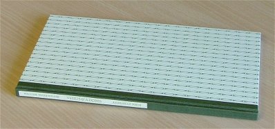
The book itself is a very handsome object, long and thin with printed pattern paper and label on the spine; a joy to hold. Now it is time to open it.
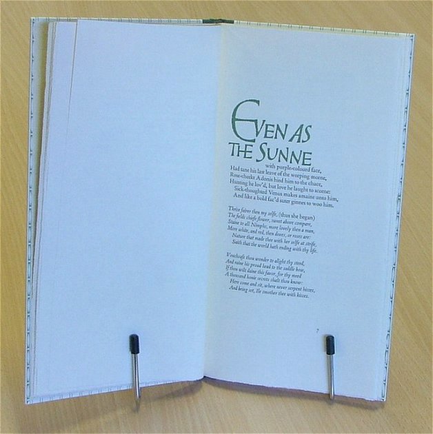
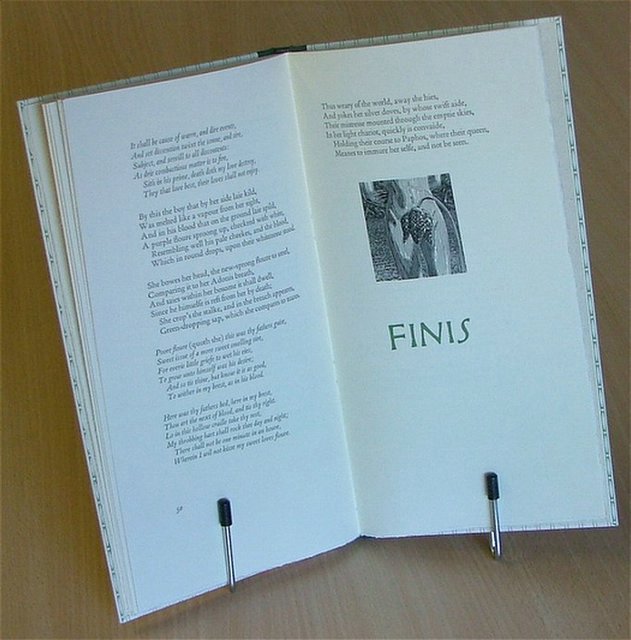
Dont forget that you can enlarge any of the photographs by clicking on them.
Frontispiece
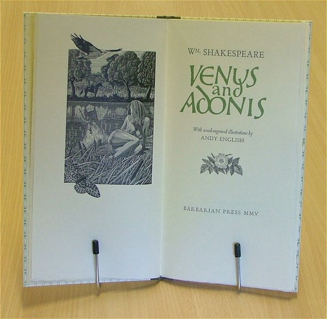
Venus reclines beside a pool and spies Adonis approaching and our story is about to begin. I love the design of this book - and the wonderful calligraphy that Crispin has used
The Hare and the Roe

This is the engraving that I enjoy the most from this set. As always, Jan has printed this block to perfection. If I never engraved again, I hope that people would remember me fondly for this image alone.
The Lark
 Readers of this blog will have already seen the lark as a block and as a proof copy. Here it is at the top of its page as planned.
Tuesday, November 01, 2005
At Work
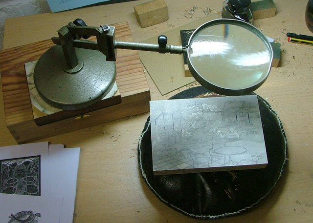
I thought I would end todays long overdue splash of blog activity with some current work. This block is a material called "Resingrave". It is inferior to wood for much of my really detailed work but I do like it for larger and looser things as it is relatively inexpensive and does engrave well, especially the newest formula.
This project is a fairly loosely observed sketch of part of our garden. It is nearly ready to proof now so I will keep you up to date with its progress.
Even with the broader treatment I am giving the marks, I stll keep the magnifying glass handy to inspect the tiniest areas.
Nearly a Birthday!

I have already published this photograph on my Albion Press blog but I also wanted to show it here. It is just about a year since my Albion arrived and it is working well. I have replaced/repaired missing parts and I just need a drop handle to work the mechanism that winds the bed in and out. In the background are favourite engravings by Pam Hughes, Ben Sands, Peter Reddick and a lithograph by Carel Weight (I seldom display my own work). This is a happy place to work and a real refuge from the madness...
Autumn
Well Autumn is definitely knocking on the door and I am resigned to cooler days. We have been reaping the benefits, thought, and Joan made the first batch of crab-apple jelly from the hedgerows. I have tidied up the garden and garage and took a van full to the "tip". I normally take a little money as they sell things that people have discarded. I normally come home with flowerpots, an office chair or somethng similar.
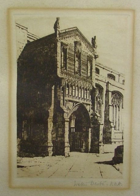
This time I returned with a large flowerpot and two framed pictures - all for £4. The first was an etching by Walter Dexter.
Now Walter Dexter was probably the first artist who caught my young eye during an early visit to Kings Lynn museum in the county of Norfolk. I remember a painting of a workshop - rather like my Grandfathers' workshop - and a wonderful landscape of Kings Lynn seen across the river. These pictures made me feel something for the first time - possibly because I was seeing them for real, rather than looking at reproductions in books. Now I finally own a Walter Dexter. It shows the porch of St. Margarets Church in Lynn (I met my wife a very short walk from this doorway); it is inscribed "No.1" away from the image. There is a little staining on the sheet but the image is good.
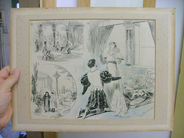
The second picture was a suprise. It is a sheet of illustrations by a very well respected French artist called Paul Destez, who worked around 1900. I love penwork from this era and this love helped establish my decision to work in black and white. It now joins works by Robert Anning Bell and Ernest Shepard in my collection of original pen illustrations. Incidently, Destez was either an engraver or engravings were made from his designs. I think probably the latter. I have posted images of both pictures.
This time I returned with a large flowerpot and two framed pictures - all for £4. The first was an etching by Walter Dexter.
Now Walter Dexter was probably the first artist who caught my young eye during an early visit to Kings Lynn museum in the county of Norfolk. I remember a painting of a workshop - rather like my Grandfathers' workshop - and a wonderful landscape of Kings Lynn seen across the river. These pictures made me feel something for the first time - possibly because I was seeing them for real, rather than looking at reproductions in books. Now I finally own a Walter Dexter. It shows the porch of St. Margarets Church in Lynn (I met my wife a very short walk from this doorway); it is inscribed "No.1" away from the image. There is a little staining on the sheet but the image is good.
The second picture was a suprise. It is a sheet of illustrations by a very well respected French artist called Paul Destez, who worked around 1900. I love penwork from this era and this love helped establish my decision to work in black and white. It now joins works by Robert Anning Bell and Ernest Shepard in my collection of original pen illustrations. Incidently, Destez was either an engraver or engravings were made from his designs. I think probably the latter. I have posted images of both pictures.
Subscribe to:
Posts (Atom)